
The loop
Your agent does the busywork.
Over MCP, your agent discovers components, composes a screen, updates props, and verifies the result in both themes. You review the design and make the calls.
Velloo is a local-first canvas for agent-driven design. Your AI agent does the design labor, composing screens from your real components and writing them into your app while you keep the taste and the direction.
Free and open source. Local-first, account-free, and telemetry-free.
A real run, unedited
One agent building a subscription flow: explore directions, refine the winner, resolve annotations, then ship it into the app.
A blank desktop frame, ready for the agent.
Choose a chapter to inspect it—the walkthrough will pause.
Works with your agent
 Claude Code
  Codex
Codex  Cursor
  GitHub Copilot
  Gemini CLI
  Antigravity
  OpenCode
  Windsurf
  MCP
MCP See the product
Velloo gives agents structured screens, live components, editable props and styles, and visual checks against the running app.
The loop
Over MCP, your agent discovers components, composes a screen, updates props, and verifies the result in both themes. You review the design and make the calls.
The same shape
Agents compose in restricted JSX; Velloo compiles it into a readable component tree in screens/<id>.json. That tree lives in your repo, diffs like code, and renders on the canvas without becoming a second source of truth.
Agent vision
Agents can capture screenshots, compare a frame with a live URL at the same viewport, inspect rendered nodes across themes, and use annotations to resolve visual differences instead of guessing from code.
The canvas
Each frame uses the same component runtime as your app. Drag it to any viewport size and compare live breakpoints, states, and responsive behavior side by side—with no export step.
Screens + boards · the model
Create a screen once, then place it in frames across boards for flows, breakpoints, and alternatives. Every frame stays linked, while the tree exposes its real component structure.
Props + styles
Select a component and a focused HUD appears beside it with the props and visual controls that matter. Changes land on the live canvas immediately, while stable component ids carry into code.
Velloo Cloud · opt-in
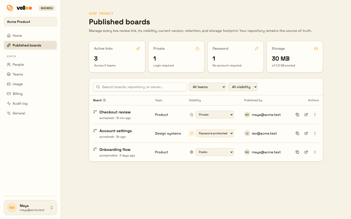
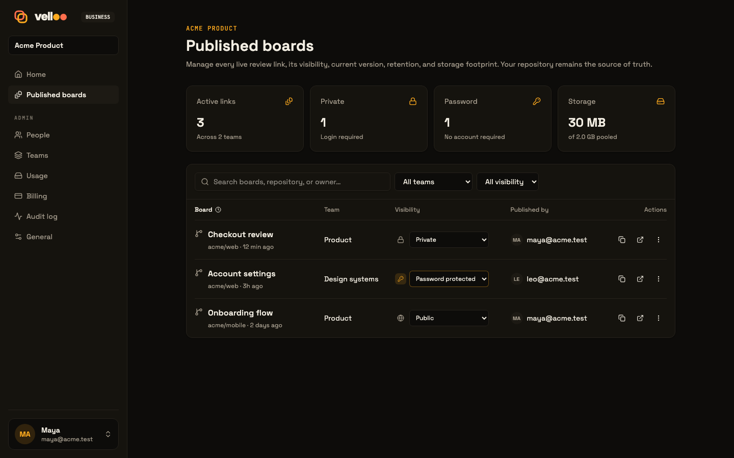
The complete solo loop stays local and account-free. Sign in only when you want a team workspace, a private review link, shared comments, or hosted asset generation through MCP.
Team workspacesInvite teammates and publish a board into the right team.
Private sharingSend an external review link without handing over the repo.
Feedback comes homeComments return to the local canvas for an agent to resolve.
Image generation over MCPGenerate, edit, cut out, or upscale assets directly into the design folder.
Framework-native
Rendering uses your real components, styling stays in the native channel, and emitted code follows the conventions you would have written by hand.
Tailwind className
Real shadcn components with Tailwind utilities, your globals, your tokens, and your class conventions.
className="flex items-center gap-2" sx prop
Real @mui/material rendered in-process. Your theme projects onto createTheme(); emitted screens speak sx.
sx={{ display: "flex", gap: 1 }} Inline style
Real antd components with its native props, token-aware CSS-in-JS rendering, and inline style objects.
style={{ display: "flex", gap: 8 }} sx prop
Real Chakra UI v2 components, projected theme tokens, Emotion rendering, and Chakra-native sx props.
sx={{ display: "flex", gap: 2 }} Inline style
Bare primitives over plain HTML with inline style objects. No component framework to adopt; Tailwind remains optional.
style={{ display: "flex", gap: 8 }} Fits your workflow
Create a new app from a direction, scan an existing one, act on review feedback, or verify against a running URL. Velloo gives people and agents one visual surface, then keeps design and implementation connected.
Scan its theme, routes, and component library before changing a screen.
Start from a Velloo direction, refine live components, then carry the chosen screens into a new app.
Compare the design with a live URL, then resolve visible differences.
Turn review comments into node-level annotations the agent can resolve.
 vell oo
 Why it is different
Velloo is not another visual source of truth to translate later. It is a repo-native model of boards, screens, frames, components, tokens, and annotations that both people and agents can reason about.
Local-first. Yours by default
Velloo runs locally and stores designs as ordinary JSON beside your code. Branch, diff, review, and revert them with git; check out a branch and the design comes with it.
An open agent surface
Discovery, mutations, inspection, screenshots, themes, snippets, and code emission are exposed through MCP—not hidden behind one model or editor.
Claude Code Codex Cursor GitHub Copilot Gemini CLI Antigravity OpenCode Windsurf MCP Help shape what ships
We are looking for designers, developers, and product teams who can put Velloo in front of real product work and give specific, candid feedback while it is still being built.
Help test Velloo →Free and open source when it ships. Testing now is how you shape it first.
Use it on a real screen, flow, or product decision
Tell us where it helps—and exactly where it does not
Help shape the workflow before it settles